“There are two kinds of MSPs in this world: Those with killer websites soaking up leads, and those stuck staying thirsty.”
— Clint Eastwood (probably)
The managed IT services market isn’t the wide-open space it used to be. Over half — 60 percent, to be exact — of the managed service providers we talked to in a recent survey described their local IT services market as “very” or “extremely” competitive.
What do you think is the best way for them to stand out?
Should they hang out on a street corner wearing a sandwich board that advertises their services?
Wait, maybe they could cut their prices so low that they lose money but, by golly, they win the sale!

Yeah, no.
Whether the competition is local or global, the modern MSP needs to convince potential clients their search is over — that even though there’s an ocean of options out there, they’ve found the perfect partner with the right expertise, services, and personality for them. To do that, the modern MSP needs a vehicle for being discovered, showcasing their value, and leaving a lasting impression. In short, they need a website.
And not just any website — a damn good one. One that tells their story. One that sets them apart. One that lets prospects know they’ve landed in the right place and compels them to take the next step.
If your 2020 goals involve looking beyond referrals (not that there’s anything wrong with referrals!) and relying on your website to generate new business, standing out from the crowd is more important than ever.
Here’s how — and how not — to do just that.
7 Things That Will Make Your MSP Website Stand Out
To rise above the competition, it’s not enough to have a cookie-cutter, brochure-style MSP website anymore. Try these easy-to-implement tactics to get you and your business noticed in a big way in 2020 and beyond.
1) Mobile-Friendly Design
In 2018, 58 percent of website visits in the U.S. were made from mobile devices.
That’s right, mobile devices such as smartphones and tablets have finally overtaken traditional computers as the preferred mode of surfing the web.
If your website isn’t set up to display flawlessly on screens of various sizes, you can bet your visitors will wander off to find a competitor’s website.
Whether you’re using a website builder or working with a team on a custom design, make sure your website is responsive — meaning it automatically adjusts to best fit the screen size and orientation of the device the visitor is using.
2) But Also, Reader-Friendly Design
Sure, some MSP websites may be going robotic (seriously, some of the advanced ones are using automated “chatbots” now!), but at the end of the day every MSP website still has to appeal to its human visitors.
That means you should have the reader in mind with every design decision you make. Your website should be a delight to look at, easy to read, and even easier to use to get in touch with you about your services.
Not sure where to start? Try the age-old adage “K.I.S.S.”
Keep it simple, stupid!
Take FunctionOne for example, where they complement eye-catching colors and imagery with a simple, single-page layout and minimal text that still tells you everything you need to know.

However, simple doesn’t always have to mean a single page.
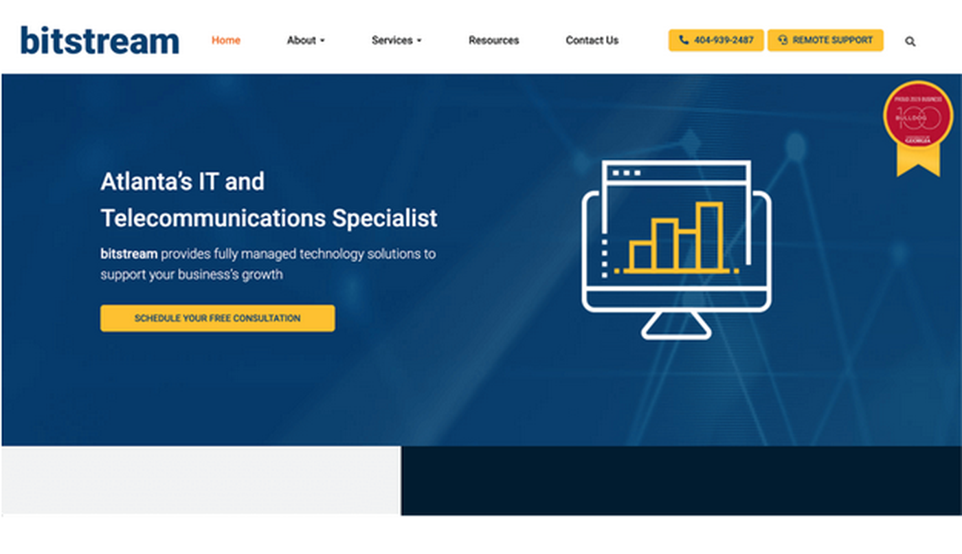
On bitstream’s website, multiple pages are well-organized and the purpose of each is clear, the overall design is simple, and all the content is easy to read.
For tips and examples on what not to do when it comes to laying out your website, keep reading!
3) Speak Your Prospects’ Language
We’ll tell you a little secret: Good MSP websites tell their story from the MSP’s perspective — here’s what they do and why they’re good at it. But great MSP websites take a different approach. They tell their story from the prospects’ and clients’ perspectives. Here’s what they’re looking for and what they’re trying to solve. Here are the things that are important to them, here’s how they know when their search is over, and here’s what happens next.
Prospects want to know you understand them, and that you can help them on that journey. Remember: Making it all about you isn’t nearly as effective as making it all about them.
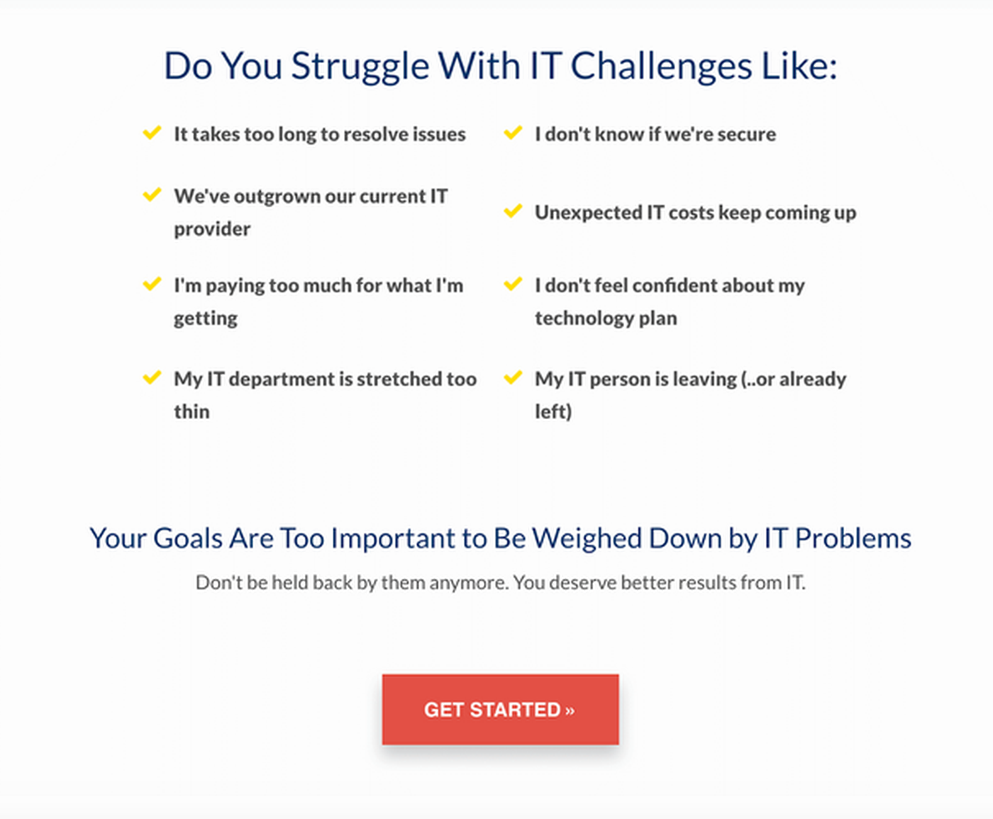
It all starts with solving their problems — not just rambling on about your expertise (not yet, anyway). Often, prospects who are visiting your website may not know what specific solutions they’re looking for, but they’re definitely aware of their problems.
Putting their struggles into words shows you really do get them, and that they’ll be in good hands if they choose to partner with you — just like Accent Computer Solutions does on the home page of their website.
Don’t get us wrong — you should obviously describe your services, too! But the more you can position them as direct solutions to prospect problems, the better. Bonus points if you can stick to using plain English and focus less on tech and specs and more on results. And don’t forget, second-person pronouns are your friends!
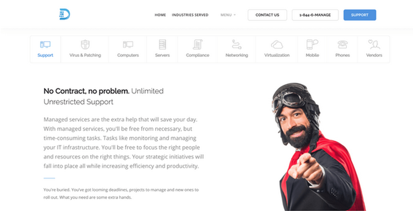
Dedicated IT does a terrific job of this on their managed services page. Their copywriting and imagery shows off their personality, too.
4) Clear and Easy Next Steps
Don’t be shy, website visitors want you to tell them what to read or look at or do next.
Every single page on your website should make it clear what the next step is — whether that’s to get more information on a landing page, fill out a form to request a quote, or give you a call.
Anticipating your visitors’ questions and proactively answering them is a hallmark of any good website. ExoSource’s site is a masterclass example. The flow of the site from section to section has the same natural progression as an initial conversation between an MSP and a prospect. It walks visitors through everything they need to know and it even goes another step further than most MSP websites by providing an interactive pricing calculator.
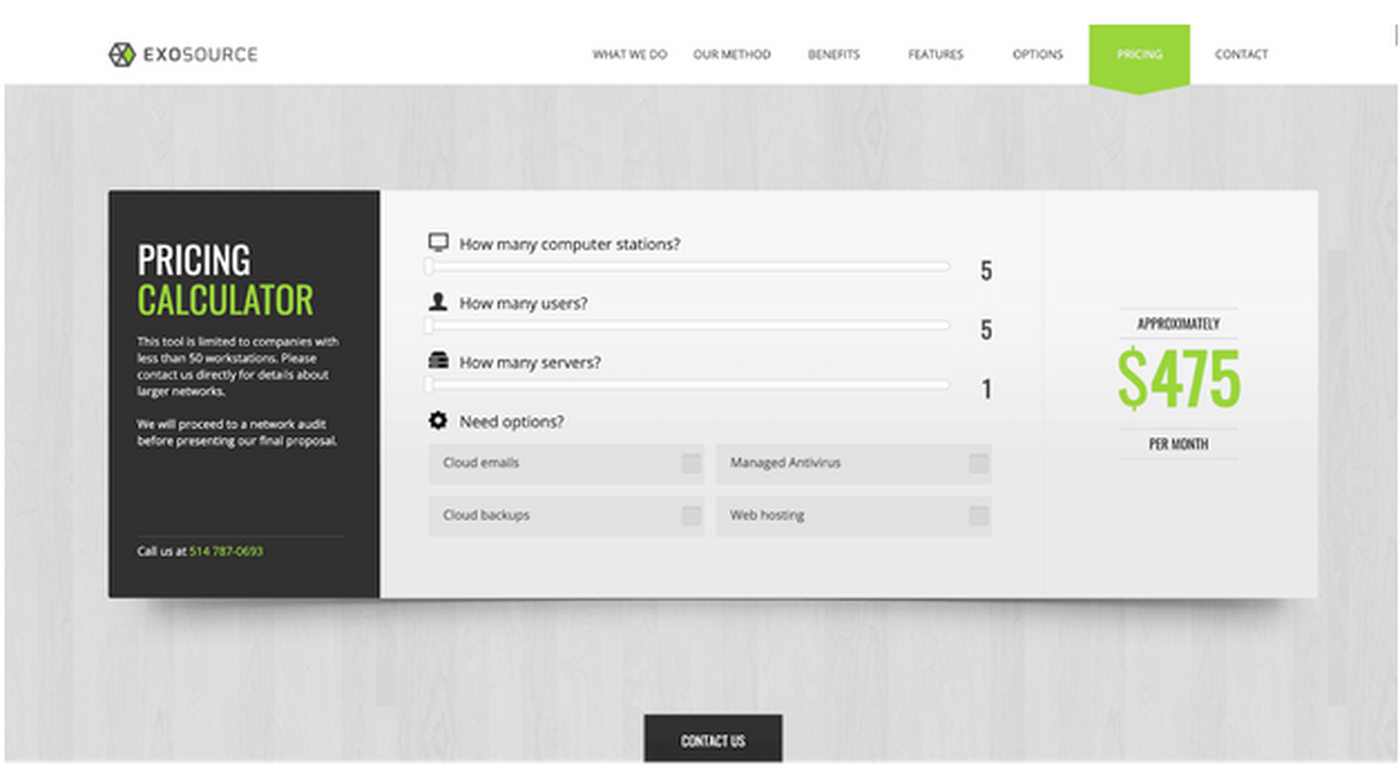
Whether you feel comfortable listing pricing or not, the big takeaway is you want to provide clear paths forward for your visitors. Following every key piece of information with an invitation to move forward through the site or take action can help turn your website into a lead-generation machine.
5) Social Proof
We’ve talked about social proof before because we believe it’s a relatively easy yet powerful way to make a positive impression on website visitors.
Social proof is a way to help convince website visitors that you’re a trustworthy partner by showing them how many other people already view you as a trustworthy partner.
Utilizing the power of social proof on your MSP website is as easy as including case studies, testimonials, reviews, ratings, or even simple quotes from happy customers.
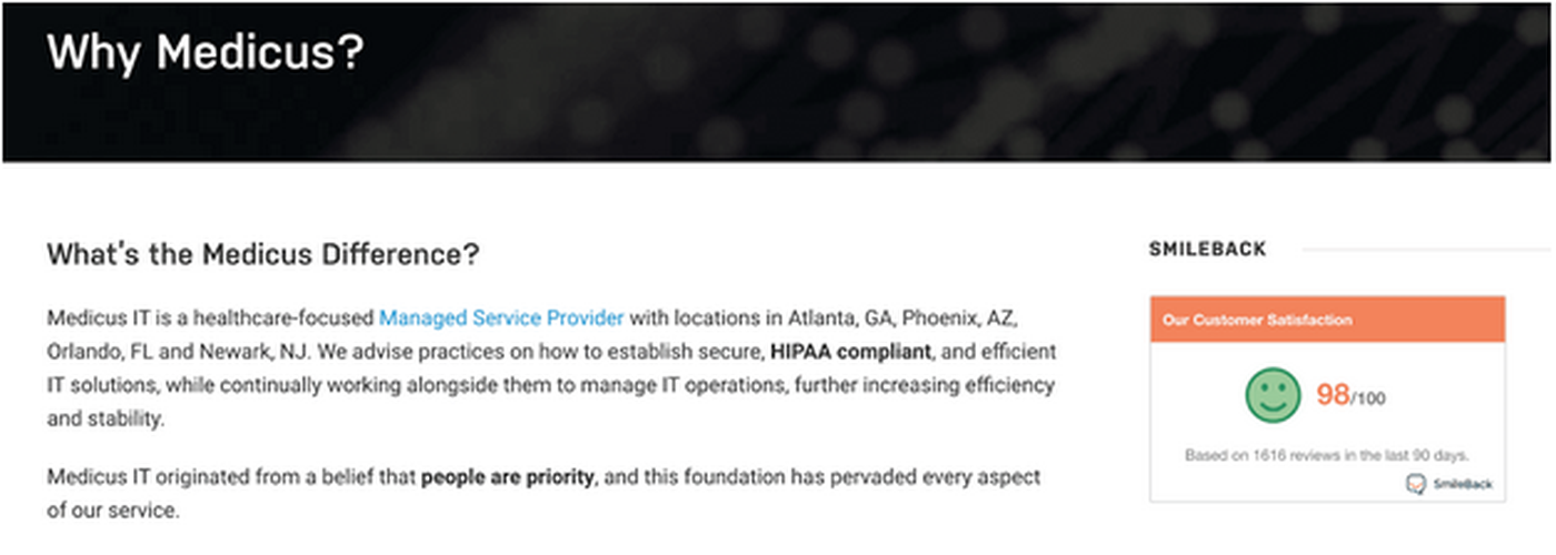
Medicus IT takes it a step further by showcasing their customer satisfaction score.
6) Accurate, Up-to-Date Content
We’re not saying you have to have a blog — we’re really not.
We get that some MPSs are still spending more time working in their business than on their business and simply don’t have time to keep up with creating and publishing content on the regular.
That said, having a site full of regularly updated content (cough *blog posts* cough) is a proven way to generate more traffic. If you’re suffering from writer’s block or don’t have the funds to pay a freelancer, at the very least you should make sure the content on your website is accurate and up to date. That means no “This page coming soon!” messages, no links to an email address you no longer use, no expired copyright or terms and conditions, and definitely no out-of-date pricing and services.
A website that hasn’t been updated in years doesn’t just look bad to Google when it’s reviewing your site for SEO purposes, it’s also off-putting for prospects who are looking for a professional to keep their services current.
7) Personality
The best MSP websites find a way to do all of the above while making you feel as though you’re getting to know the people behind the site, too.
Basic uniformity is a big problem among MSP websites. Many providers are using the same templates or working with the same agencies. The results aren’t always bad per se, but they typically don’t do much to distinguish the MSP from the other competitors in the search results. The best MSP websites have a distinct look and feel that reflects the MSP’s unique values, approach, and personality. That’s important.
Because, if you’re claiming you’re different than the competition, then your website should probably reflect that.
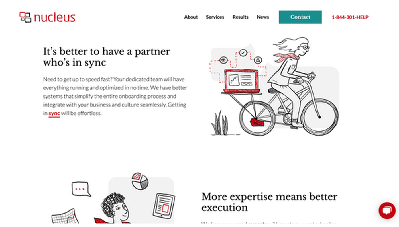
One of our favorite examples is Nucleus. They don’t just “do IT better” (as their homepage implies), they also do a better MSP website. Their thoughtful design and content convey who they are and what they provide with sharp clarity and confidence that overshadow plenty of competitors.
7 Deadly Sins to Avoid at All Costs When it Comes to Your MSP Website
The good news (well, sort of) is that the bar is still fairly low when it comes to good MSP website design.
You can put yourself ahead of the pack simply by avoiding these next seven basic — and incredibly common! — mistakes.
1) Big Blocks Stuffed with Tiny Text
Our increasingly fast-paced lifestyles combined with mobile devices that allow us to consume content on the go add up to one thing — the way we read has changed.
Today’s online consumers scan. In fact, the average website visitor only reads about 20 percent of the content on any given page.
They’re looking for specific information and they don’t want to wade through a solid block of wordy sentences to find it.
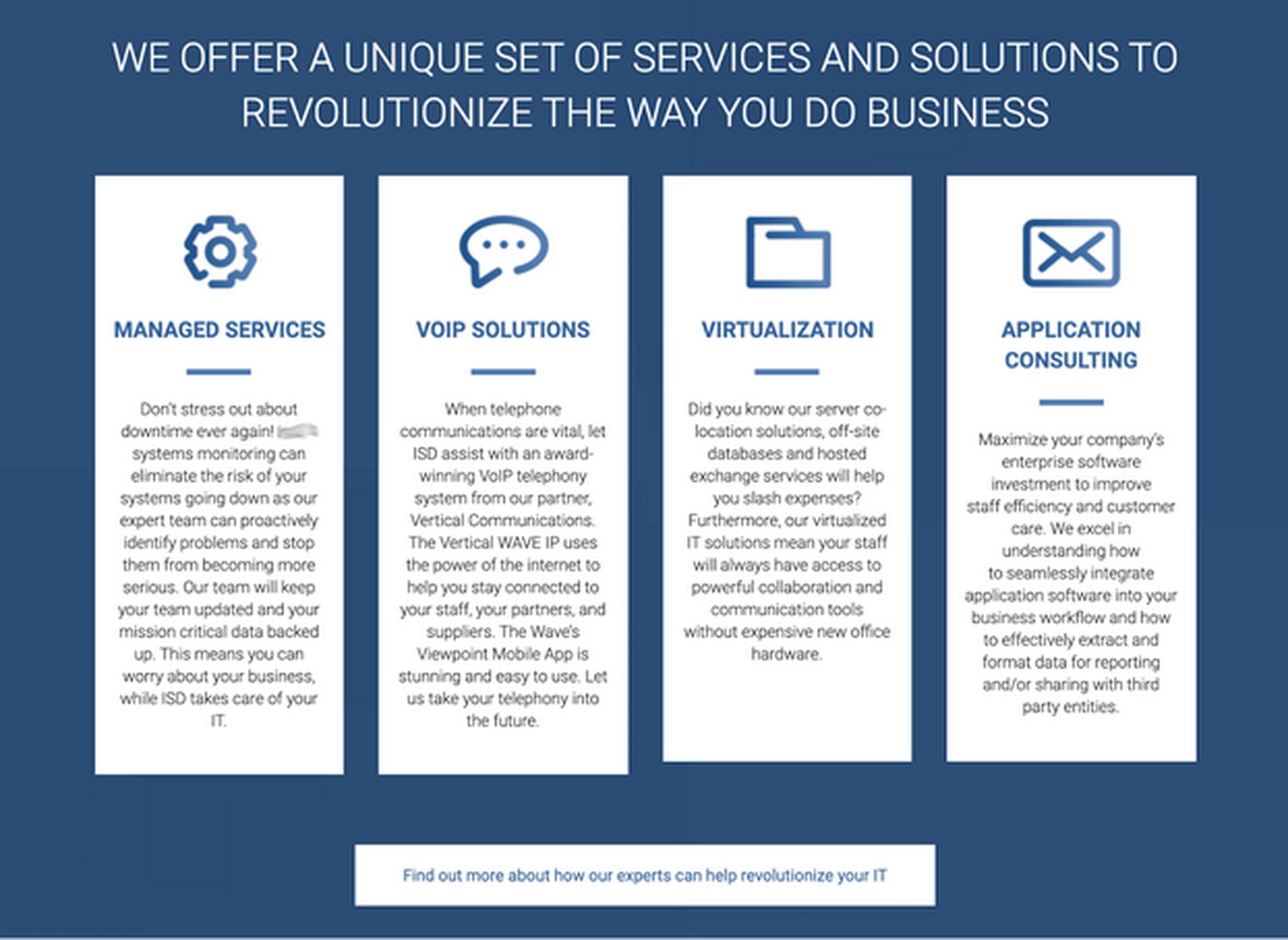
For example, there could be some great information about the business’ services and solutions in the following image, but how likely is it a visitor is going to read through those long paragraphs to find it? If visitors feel like reading or navigating a website is work they’re going to close out and try another easier-to-digest option just a click away.
Instead, when you’re writing content for online use, keep these strategies in mind:
- Create bulleted lists (like this one!)
- Use descriptive, interesting subheadings
- Write short paragraphs and sentences
- Utilize white space
- Put important information at the beginning of sentences and paragraphs
2) Hard-to-Read Typography
Aside from overwhelming walls of copy, nothing scares off website visitors like text that gives them a headache when they try to read it.
Don’t be that guy. Keep styling (italics, bold text, underlining, etc.) to a minimum and avoid color combinations that are jarring or hard to read.

Aside from eliminating excessive styling and annoying colors, you can really class-up your MSP website design by paying special attention to headers. Make sure they follow a clear hierarchy and that each heading tag (H1, H2) is distinct.
If you trust your design instincts, try high contrast fonts and accent colors to make important calls-to-action (CTAs) stand out.
3) Generic or Low-Quality Imagery
We hate to say it, but we’re all thinking it — generic stock images make your website look cheap.
Aside from that, generic stock photos don’t even achieve their goal of engaging website visitors because, like the one below, they’re typically unrelatable.

While generic imagery is bad, low-quality imagery may be even worse.
We actually see this all the time with one of the most important image files on an MSP’s website — the logo.
Often, this is because the logo is an older file that’s been passed down from a bygone era. If a total logo redesign is out of the question for you, at least track down or recreate a hi-resolution version.
4) Excessive Pop-Ups
We have to address pop-ups as they seem to be becoming more and more prevalent.
While they can be effective if used sparingly and for a really good reason; too many chat, sale, and email signup pop-ups can be disruptive and overwhelming.
Trust us, there’s software out there that can help you manage pop-ups in a smart way so that they actually engage your website visitors instead of prompting them to leave your site before they’ve even seen what you have to offer. Try Wisepops or Poptin to build beautiful and contextual pop-ups that help retain visitors instead of repel them.
5) Visual Clutter
Just like people, websites need room to breathe.
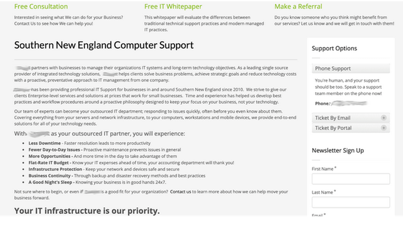
The visual clutter in the example below is the result of cramming too much design and content into one space. This lack of breathing room between items forces the eye to jump around and makes it really hard to prioritize and process the information.
Remove visual clutter by creating more “white space” (the unused area around an object) around all the elements that make up your website design. If in doubt, remember that less is more.
6) Mental Clutter
A more abstract concept, mental clutter is the result of an MSP website that has a whole lot of words that never manage to tell the reader anything.
The more content you have, the less likely a website visitor is to read and process all of it. And the more you favor content instead of strong, graphic CTAs; the less likely you are to get many leads from your website.
The best way to determine whether your website is going to clutter a reader’s mind with too much info and not enough action is to read it with a discerning eye and ask: “Would I say all of this to a prospect on the phone or in a meeting?”
If the answer is that, no, you wouldn’t include something in a pitch — then it’s time to cut it from your website.
If your website aligns with the majority of our “7 Things That Will Make Your MSP Website Stand Out” above, chances are you’re successfully avoiding creating mental clutter.
7) Lack of Brand Cohesion
Disparate styles throughout the same website can make it feel disjointed and unprofessional.
Luckily, brand cohesion is easy to instill with the help of a brand guide that outlines the specific design styles, fonts, and colors that should be used on your website. If you don’t already have one, almost any web designer should be able to whip one up lickety-split.
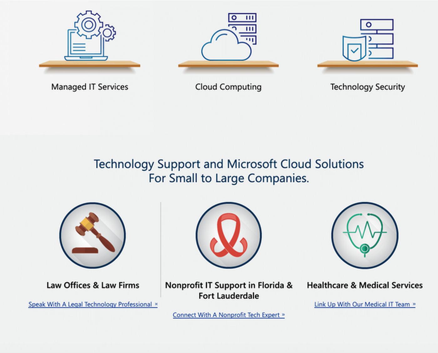
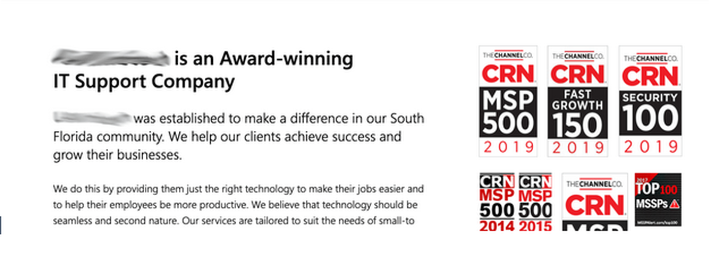
What you don’t want to do is turn out like this MSP website that lacks cohesion in the background color, combines too many graphic styles, and even implements some award logos that look a lot like ads — all on the same page.
Want More Practical Tips for Building a Better MSP Website?
If you’re looking to design — or redesign — a great MSP website that aligns with the do’s and don’ts that we’ve explored here, be sure to check out our article about Building the Right MSP Website: How to Get More Visitors and Leads.
And if you’re one of those MSPs who is so busy working in your business that you don’t even have time to think about optimizing your website to generate leads, we also recommend you try NinjaRMM for free and finally get the efficient, modern IT and network management software you deserve.
Jonathan Crowe is director of content & brand strategy at NinjaRMM. Read more NinjaRMM blogs here.


